- Contact
- Down
- Pass Pos
- Up
- Contact (Repeated)


The Bauhaus poster, which I have chosen strikes me with its combination of geometrical shapes and embedded typography which were balanced perfectly in a very dynamic composition. this is a perfect example of the Modern movement and its core ideas are implied into this poster: simplicity, limited use of colours clear message in a combination with well design sen serif font. The poster has been set in a golden ratio composition as most of the info is is close to the right hand side. There are many ascending and descending diagonal lines, which interact with each other and lead the viewer’s eye.
The colour are very dark with a cream colour to help the red and dark brown stand out. Many of the shapes on this poster are very straight are square. This is also how the logo is made so the poster fit the logo which is pretty ingenious. However the font of the text is very opposing to the theme of straight lines because of the fact that the letter of many of the text is very rounded. For example all of the word Bauhaus is very rounded. Also some of the details of the letter were hyper extended to fit the style of the diagonal lines. At the beginning of the 20th century, graphic designers have used traditional painting technique to create their original design.They used different brush sizes and gouache or tempera paint to create the poster design. For the text they used stencils when applying the the paint. The whole process was time consuming as the artists had to wait each layer to dry perfectly before applying another colour.
In the Contemporary poster it has been set in a rule of thirds and like the Bauhaus poster it have red, brawn and cream colours, which complement each other. Browns and Creams are used to make the building stand out for the red background. The artist used a close up of a buildings to created a simple but effective picture of the building. In the poster the artist used almost no words and the words that are there are the title and the info that is crucial. The whole idea of this poster is to present the chosen object from a close up view and by doing that to reveal more details and emphasise on the elegant silhouette line of the building. The graphic designer used more minimalistic approach to the layout of the poster.
This digital poster has been created mainly on a computer programs like Photoshop and Illustrator. Only the initial sketches were hand drawn. Nowadays the use of the new technology shortened a lot the designing process and the following mass production as it takes seconds to send digital files to a long distance. In comparison , the Bauhaus poster layout looks too busy, while the contemporary poster design emphases on the silhouette lines and the dominant symbolic colours. The influences of the Bauhaus style are recognisable in the modern poster design as there is a revival of the modernistic ideas in contemporary art form.
Final Poster Design:
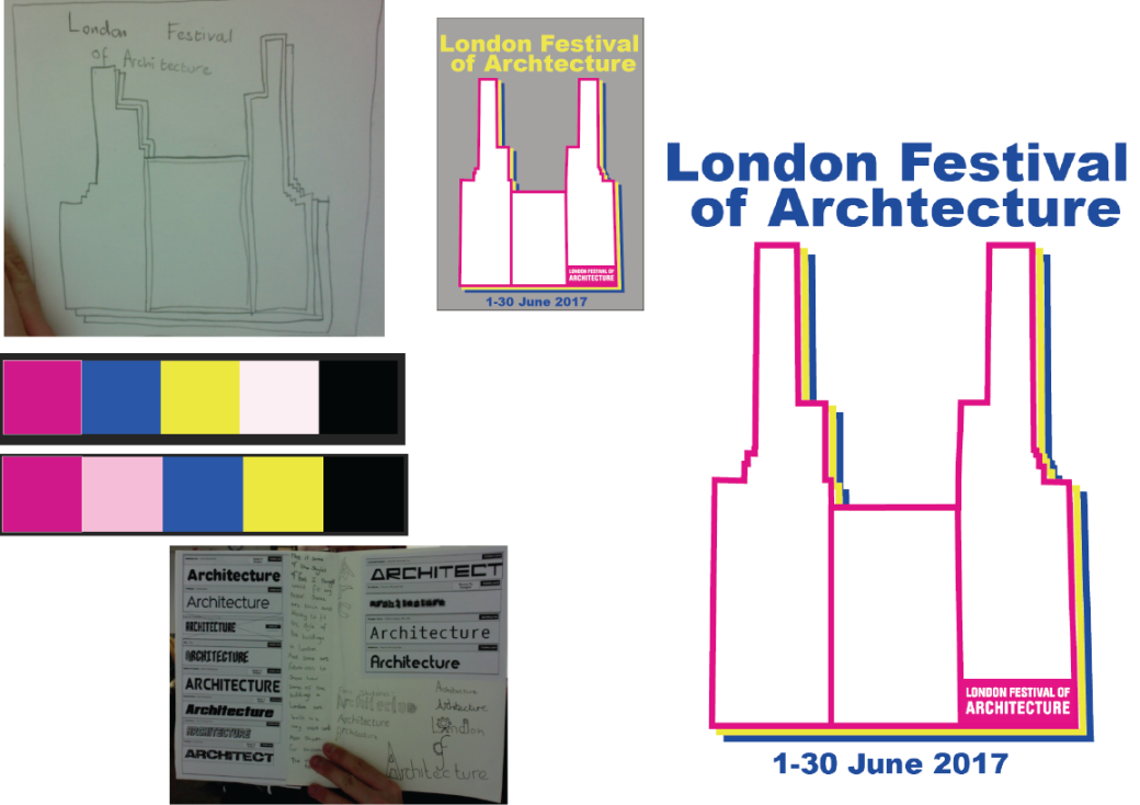
This design is based on Battersea Power station. It is a fairly simplistic design because it has not got many aspects to it. There are only three and these are: the date, the heading and the actual building. I consider the design to be very contemporary, as it fits with many contemporary posters that already exist such as the poster in my contemporary poster analysis.


I chose this colour scheme because of the way that each colour stands out from the other one, i.e. yellow from blue and pink from yellow. The outline of the building is pink because the original logo for the London Festival of Architecture is the same pink colour and it would take people’s attention away from the design.
I think my design is good because of the simplicity of it, meaning that it is easy to understand what the poster is advertising. The big text font makes it easily readable from afar and the bright blue colouring of the text is striking.
However, there is always room for improvement and I think that the pink outline of the building could be bigger to make it more eye catching.
Final Design:

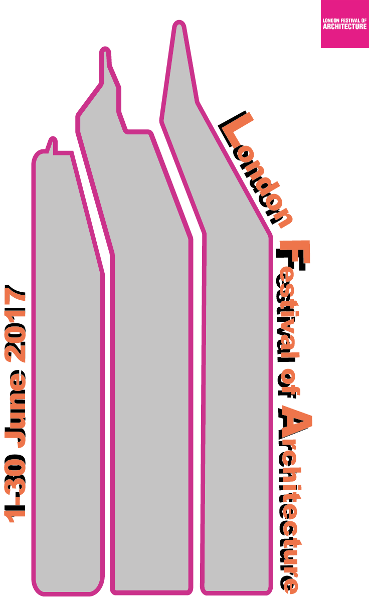
The second design: This design is based on the idea of the different views of the shard. The tallest building in London by far.


This design like the other ones was created in Illustrator and consists of 3 different views of the shard. Design 1 and design 2 (above) are both the same sort of design but the font colour has been changed to see what colours would stand out against the grey of the buildings. I ask a few people and they seemed to agree with me that having the writing as pink would be to big of a eye sore for the person. The orange is however more pleasing to the eye and allows the viewer of the poster to see the buildings and then the writing. The final design (Below) is not at all different to the top left design. Things that are good about it is the fact that it is simple and isn’t an eye sore. Things that are not good are the fact that it may be two simple and not enough colour.
Offset printing is when an image needs to be printed it is split up into its CMYK versions. Then papers would be fed through cylinders which have any of the colours from CMYK. The paper is then passed through every colour until the final image is created. Then it is covered in a thin layer of dust to make sure it doesn’t leak on the paper below.
Litho Printing is when the image is burned onto a metal plate using a laser
Bleed- 3-5 mms
Screen Printing:
Screen printing is a printing technique whereby a mesh is used to transfer ink onto a substrate, except in areas made impermeable to the ink by a blocking stencil. A blade or squeegee is moved across the screen to fill the open mesh apertures with ink, and a reverse stroke then causes the screen to touch the substrate momentarily along a line of contact. This causes the ink to wet the substrate and be pulled out of the mesh apertures as the screen springs back after the blade has passed.
Screen printing is also a stencil method of print making in which a design is imposed on a screen of polyester or other fine mesh, with blank areas coated with an impermeable substance. Ink is forced into the mesh openings by the fill blade or squeegee and by wetting the substrate, transferred onto the printing surface during the squeegee stroke. As the screen rebounds away from the substrate the ink remains on the substrate. It is also known as silk-screen, screen, serigraph, and serigraph printing. One colour is printed at a time, so several screens can be used to produce a multi-coloured image or design.
Idea one was created when I was scrolling though pictures of famous London Buildings and many of the buildings included Triangles. Then the idea came to mind. So I combined both triangles and simple black and white colours to make a simple design.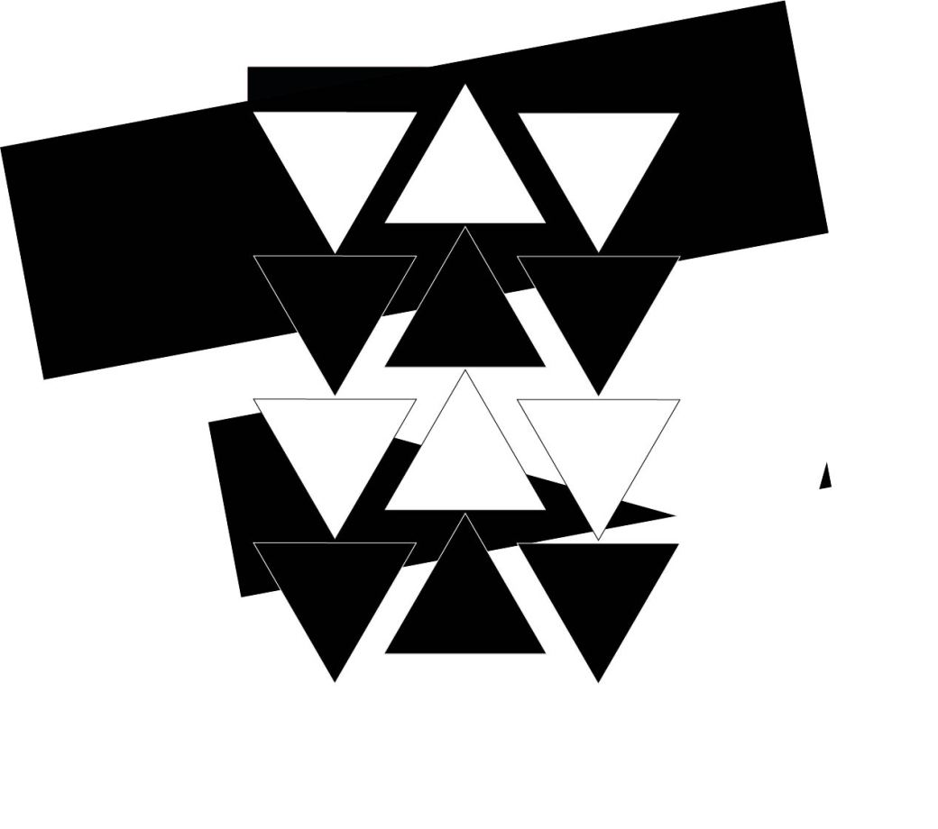
Then I realised that I was missing the most important thing. The information! I then added the information and it came out to look like this.
I spent many days thinking that it was finished. I was wrong. The font didn’t match the kind of poster I was making. The font looked more hand written which I thought was not the sort of style I was going for. I was going for a more straight and blocky feel as when you thought of Architecture you think of buildings. So I tried some fonts and found myself settling with Arial Black. I also realised that the numbers were to spaced out and they looked like just floating numbers so I moved the together. Also I added the London Festival of Architecture logo


Many things I liked the look of many things but 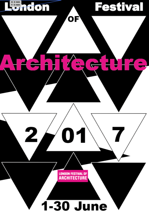
Then I though to myself that the logo is very pink and make take peoples eyes away from the actual poster so I made the word Architecture Pink as it makes it stands out. The Final version of this poster is: 
This is a mood board on famous buildings in London as this is what my poster will be based upon architecture in London.

